Diriyah

An immersive storytelling experience for the Diriyah mega project

Services:

UI Design

Year:

2025

Project Summary

PROJECT OVERVIEW
The Diriyah Project, a SAR 64 billion giga-project under Saudi Arabia’s Vision 2030, aims to transform the historic birthplace of the first Saudi state into a premier global cultural, heritage, and lifestyle destination. This massive development spans 14km² and features over 18,000 residential units, 28+ hotels, and vast retail/office spaces, all rooted in traditional Najdi architecture and world-class sustainability standards.
The Diriyah app core purpose is to be a single, fluid platform that facilitates personalised client journeys, showcases the vast masterplan, provides real-time unit availability and detail (floor plans, amenities), and integrates high-fidelity, fluid tours using Unreal Engine environments. The project also included the establishment of a robust design system to ensure brand consistency across all branded and non-branded district assets.
KEY OBJECTIVES

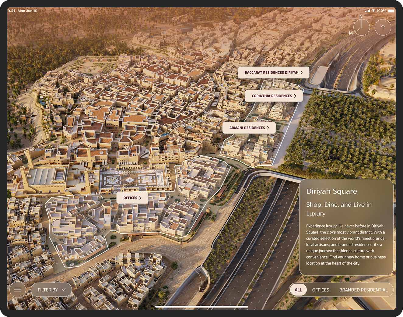
Key objectives for the Diriyah app:

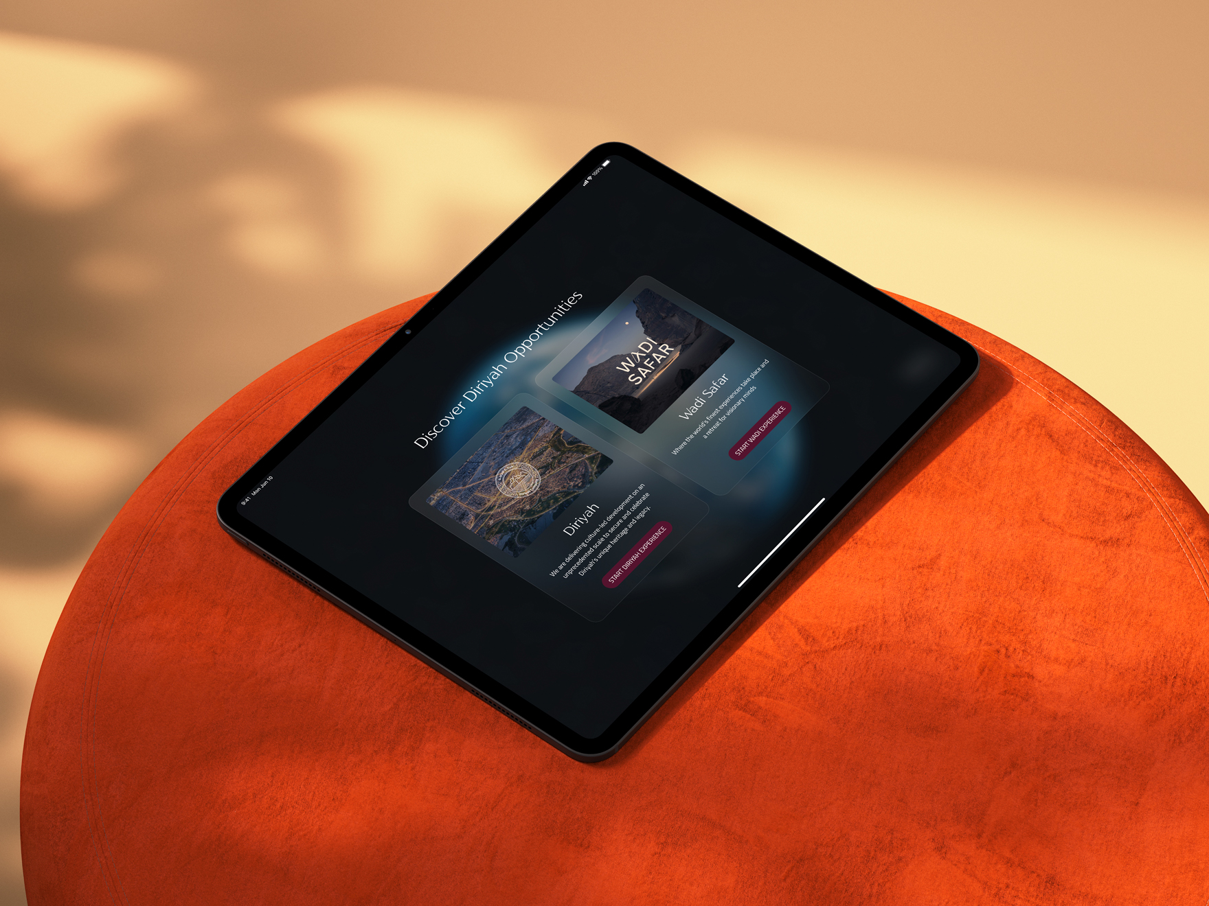
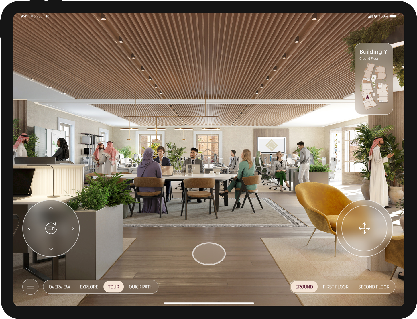
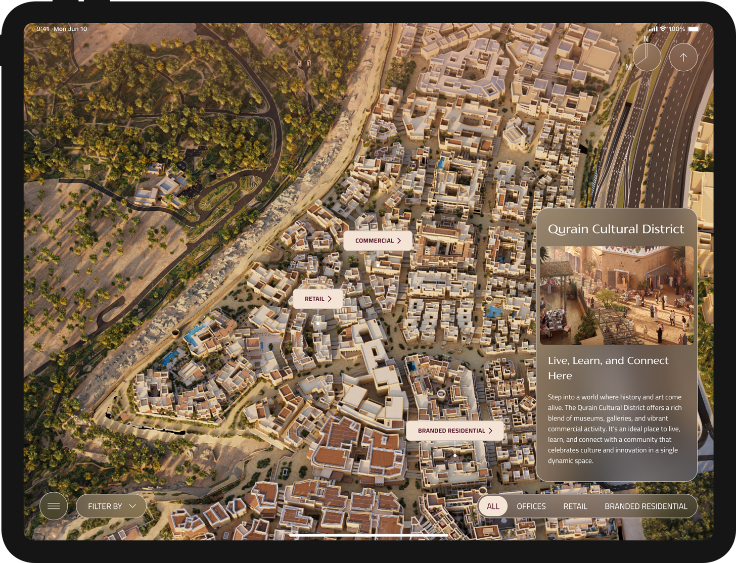
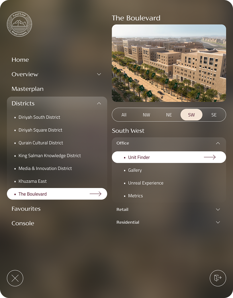
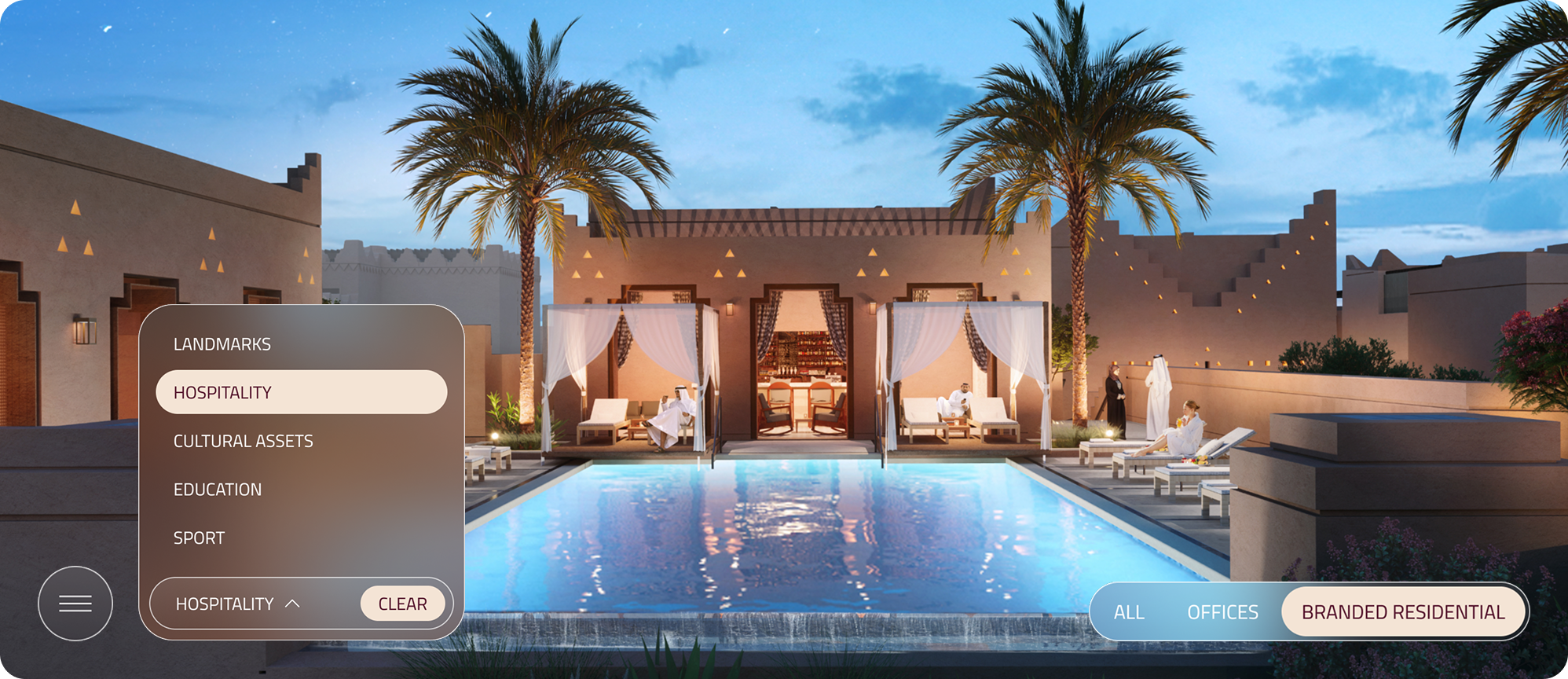
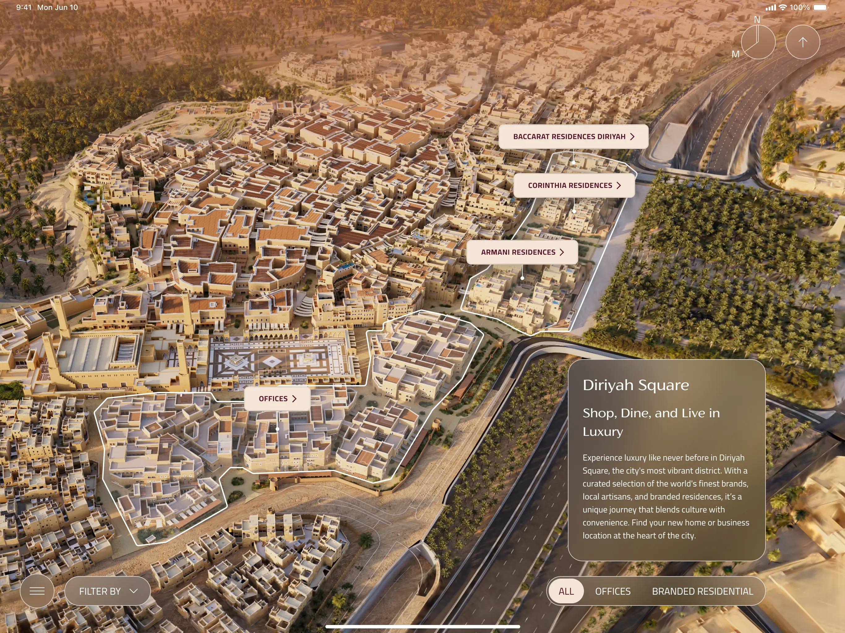
- Elevate the Storytelling Experience: Create an elegant, intuitive, and visually stunning iPad interface that allows sales representatives to effortlessly navigate the Diriyah vision, location, and history, transforming a complex masterplan into a compelling narrative for the client.
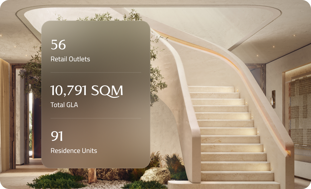
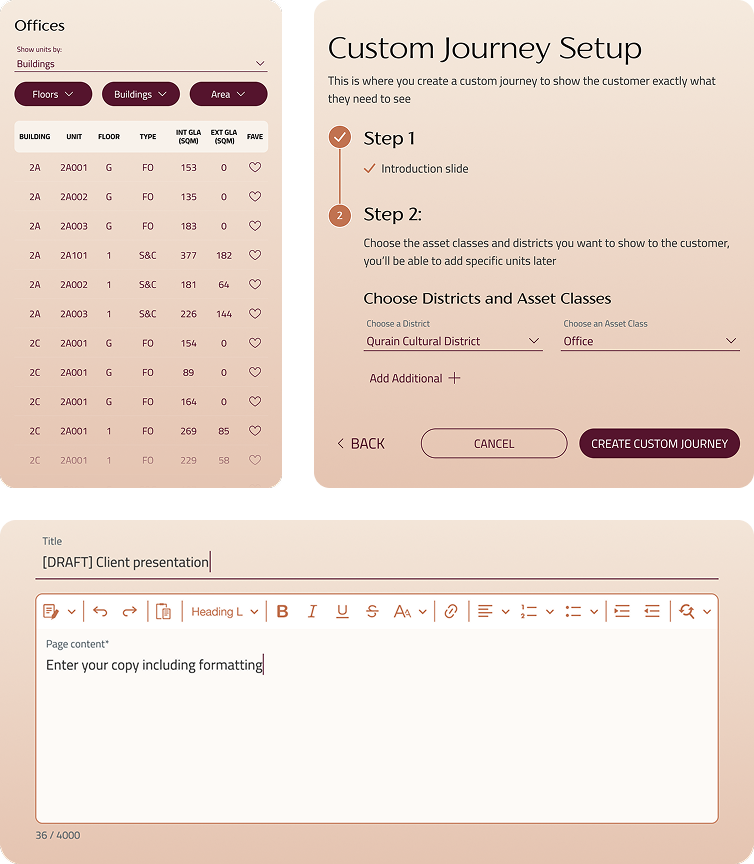
- Facilitate Transactional Efficiency: Provide sales reps with instant, accurate access to all unit inventory, floor plans, and availability status (Office, Residential, Branded Residential, Retail), enabling immediate client feedback and the creation of "Favorite" lists to accelerate the sales pipeline.
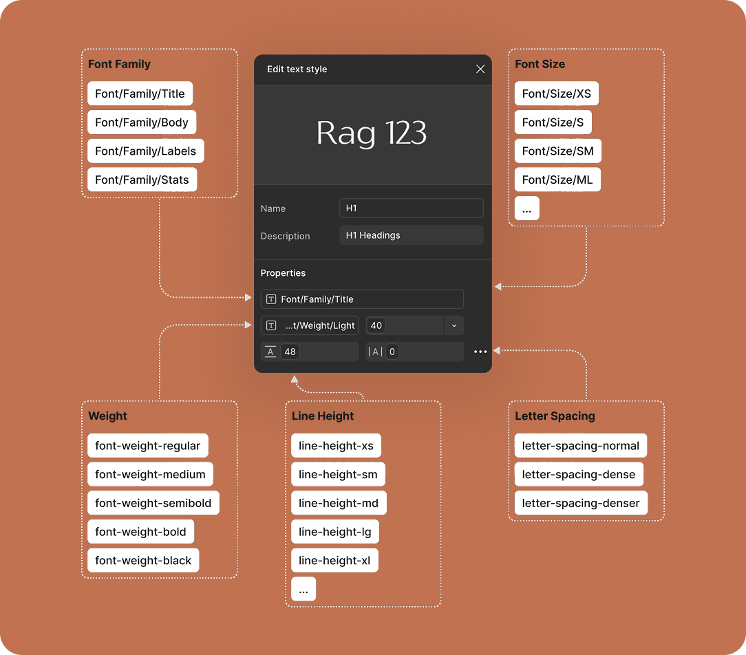
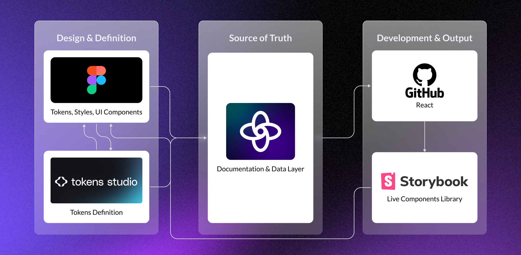
- Ensure Brand Cohesion: Establish a comprehensive, scalable design system suitable for a luxury audience, ensuring visual and interactive consistency across diverse branded and non-branded districts within the application, and positioning the entire development under one unified luxury umbrella.

The Challenges

Maintaining Design System Integrity

Creating a design system flexible enough to accommodate the unique branding requirements of ultra-luxury, often branded, residential and retail districts, while still adhering to a core Diriyah visual identity.

Interactive masterplan as the main navigation tool

Creating an intuitive, gesture-based interaction model for the complex "splat" masterplan where users can fluidly transition between macro (district overview) and micro (unit-level detail) views without relying on deep navigation menus or breaking the visual context.

Seamless Contextual Switching

Designing the navigational structure to allow users to quickly detour from a pre-set presentation path to a client's off-script question.

Business requirements and user needs

Scalable design system

A flexible design system must be created to maintain a consistent luxury aesthetic across all district visualisations, regardless of their individual branding.

Immersive experience

The app must seamlessly present a 3D map (splat) to showcase Diriyah project from a district to an unit level.

Personalisation

"I need to create a tailor-made, focused presentation for a high-net-worth client based on their expressed interests."

Analytics

"I need to track my own and my team's performance and understand which sections of the presentation are most effective with clients."

Screen share

"I need to share my screen effortlessly with a client or group in a meeting room without technical delays"

Branded content

The app must visually integrate the unique branding, logo, and tone of branded residential districts when presenting their specific content.

Masteplan filtering

The interactive masterplan ("splat") must offer simple toggle filters to display specific property types
"When I'm on the masterplan, I need to toggle visibility to show only the retail districts so I can focus the client on commercial opportunities."

Proximity visualisation

The unit detail view must provide a clear, visual overlay on the masterplan showing the unit's proximity to pre-defined amenity types

Data overlay

The district overview screens must allow for a quick-view overlay of key performance and development statistics relevant to that specific area.

Quick access

The app needs a minimal, always-accessible quick menu (console) allowing the representative to jump directly to any major district or feature page.

Live annotations

The app must include a simple pen/drawing tool that allows the sales representatives to temporarily mark or annotate content (like circling units or drawing lines on a floor plan).

Problem statement

The sheer density and diversity of the 14km² Diriyah project's masterplan, encompassing 100's of units across multiple asset classes (Offices, Retail, Residential, Branded Residential) and numerous Points of Interest (Cultural Assets, Education, Sports), results in a condition of visual and cognitive overload for the client.
Sales representatives lacked the filtering tools necessary to declutter the 3D visualisation, isolate specific asset classes based on client interest, and maintain a compelling, focused narrative. This lead to presentation delays, reduced clarity, and a failure to capitalise on the immersive nature of the 3D environment.

Solution

The adopted solution was to introduce non-intrusive controls to manage the visualization layers and a set of contextual filters.

Problem statement

While Unreal Engine provides unparalleled visual fidelity, traditional free-roam 3D navigation is often cumbersome and error-prone during high-stakes sales presentations. Sales representatives frequently struggle with "navigational drift" (getting stuck in corners or walking into walls) and "orientation loss" (losing track of where they are in the floor plan). This technical friction distracts the client from the property’s value proposition and forces the representative to focus on controlling the app rather than engaging with the client.

Solution

POV teleportation points: Overlay a series of subtle markers on the floor. Tapping these instantly triggers a smooth camera transition to a professionally framed viewpoint.
Interactive floor plan: An interactive point of reference for real-time location awareness and orientation.

Problem statement

Transitioning from broad district storytelling to granular unit discovery presents a significant navigational hurdle. Jumping directly from a 14km² masterplan to an unfiltered list of 18,000 units causes cognitive overload for both the representative and the client.

Solution

The solution relies on a "Filter-Zoom-Search" workflow that bridges the gap between the main splat and the unit finder (per asset class).
The interface required a "Discovery Layer": an intermediate, zoomed-in environment where users can isolate specific asset classes (Offices, Retail, Residential, Branded Residential) and POIs to review key statistics like GFA and projected population. This focused context is essential before activating the Unit Finder for specific property exploration.

Problem statement

Differentiated Output & Secure Session Control
Standard mirroring exposes technical UI (menus, keyboards) to the client, breaking the luxury immersion and hindering spontaneous navigation.

Solution

Secure connection: Instant connection via a unique 4-6 digit session code
Presenter Mode: iPad shows the Journey timeline, private notes, and skip-chapter controls.
Clean Client Feed: External display shows only UI-free, high-resolution 3D renders and cinematic tours.

Problem statement

Standard decks don't work for high-value investors who expect a personal touch. Manually pulling together heritage stories and floor plans is slow and usually results in messy, off-brand presentations. On top of that, letting every staff member build their own collateral risks "design drift" and weakens the brand's premium vibe.

Solution

Authorised "Super Users" could create bespoke, high-impact narratives that flow logically from cultural heritage to technical unit specs, inclusive of client-specific branding to foster a sense of exclusivity and personal attention
Modular Content Hierarchy: A drag-and-drop builder to assemble a structured flow
Custom Presentations & Templates: Users can create a presentation from a set of templates, or build a Custom Journey slide-by-slide for high-priority leads.

Multi-brand design system

TYPOGRAPHY
SEMANTIC TOKENS
Creating a design system flexible enough to accommodate the unique branding requirements of ultra-luxury, often branded, residential and retail districts, while still adhering to a core Diriyah visual identity.
Grey 2800
#313131
Grey 700
#585755
Grey 600
#6D6E6E
Grey 500
#DBBC9A
Grey 300
#C6C6C6
Grey 200
#ECECEC
Grey 100
#F5F5F5
Brown 700
#61452F
Brown 600
#C17250
Brown 500
#C1937E
Brown 400
#DBBC9A
Brown 300
#F4E4D5
Brown 200
#F2E8D2
Brown 100
#F8F2EB
Khaki 800
#4C3E12
Khaki 700
#706541
Khaki 600
#655F4B
Khaki 500
#847A5B
Khaki 300
#9F8D6E
Khaki 200
#D7D2C4
Khaki 100
#E7E5DF
Purple 800
#460E24
Purple 700
#55142D
Purple 600
#47253C
Purple 400
#6E4861
Purple 300
#9D96B2
Purple 200
#A58F97
Purple 100
#BDAEB8
Red 800
#6F090B
Red 700
#C9F1E22
Red 600
#982C31
Red 400
#AA484C
Red 300
#BE6468
Red 200
#F2E8D2
Red 100
#F5E8E9
Green 900
#0C1F1E
Green 800
#152F2E
Green 700
#1E4132
Green 600
#2B4342
Green 300
#465D5D
Green 200
#5D7C7C
Green 100
#EAF1F0
DESIGN SYSTEM PIPELINE

The results

Unified Visual Language

The establishment of the Diriyah design system successfully aligned over 12 sub-branded and non-branded districts under a single premium umbrella, ensuring 100% brand consistency across the app.

Scalable Component Library

The UI kit developed for the project reduced the design turnaround time for new district additions by 60%, allowing the team to quickly integrate new phases of the masterplan as they were released.

Increased Narrative Retention

Qualitative feedback from sales trials indicated that starting with the "Vision" and "Heritage" story slides before moving to metrics led to a significantly higher client recall of the project's cultural significance.

High Adoption of Journey Customiser

Within the first three months of launch, 85% of high-priority client meetings utilised the Journey Customiser, moving away from standard templates in favour of bespoke, white-labeled presentations.

More Work