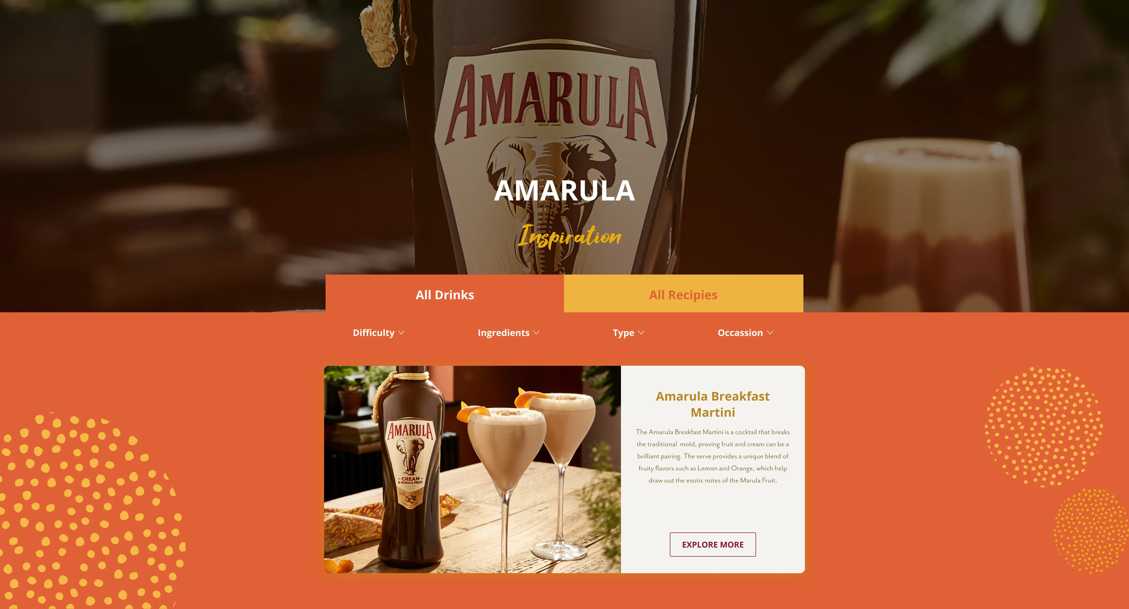
It is a Marula-based alcoholic drink from South Africa and the onlycream liqueur which uses real Marula fruit, harvested from Marula treesthat grow wild and uncultivated in the subequatorial regions of Africa –the only place on the entire planet where they grow.
This was a short turnaround project with a limited budget. The client focused on delivery within a strict timeline.
THE BRIEF
Amarula’s website was outdated and painfully slow, which has led to local markets going rogue with creating their own sites. I have been briefed to design one global website for Amarula with some local markets variations that brings their ‘real free spirit’ brand essence to life and inspires their consumers.
The brief was to redesign the entire website using existing copy and content. The approach was to reuse modular components as much as possible as the dev resources were limited.
The Challenges
Amarula brand faced mutiple challenges: - Losing cultural relevance in their lead market (South Africa) - Low awareness and consideration in the rest of the world. Mainly due to being massively overshadowed by the more popular Baileys. - From a UX perspective the previous site was not well thought out. The site was not mobile friendly and this led to a major drop-off rate with a poor conversion.
UX CHALLENGES
Poor usability and non intuitive user journeys
The previous website had usability issues, specifically on mobile
Low engagement & adoption
Low conversion & adoption rates. Short user sessions length
Poor navigation & IA
The previous website navigation and IA had to be simplified. Simpler navigation can lead to better metrics
BRAND CHALLENGES
Low awareness
Low brand awareness especially amongst the Gen Z generation
Low retention
Amarula brand is overshadowed by the more popular Baileys. The customers were not staying loyal
Brand identity
Inconsistent identity in visual design, branding elements, and messaging across the website
Mapping key user journeys
INFORMATION ARCHITECTURE
Amarula website sitemap
As part of the website redesign process, we revisited the sitemap with a focus on the target audience. By considering the preferences of Amarula's desired demographic, aged 25-34, we prioritised a mobile-first approach to ensure optimal accessibility and engagement.
WIREFRAMING
Redesigned main user journeys and existing content
Excessive content can overwhelm users, leading to confusion. Despite the richness of Amarula's brand history, users encountered complexity in navigating through multiple layers to access the website's primary offerings.
Design
AMARULA PRIMARY COLOUR PALETTE
Amarula White
#FFFFFF
Amarula Cream
#FFFEF9
Amarula Vanilla
#FEF4E3
Amarula Light Sun
#F9D48D
Amarula Yellow
#F5B844
Amarula Dark Yellow
#B78628
Amarula Sand 200
#CEC9B8
Amarula Sand 400
#FFFEF9
Amarula Sand 600
#8E7B55
Amarula Orange
#E26335
Amarula Orange 400
#C24C21
Amarula Magenta 600
#67102C
Amarula Grey
#A4A1A1
Amarula Dark Grey
#FFFEF9
Amarula Black
#3D3C3C
Amarula Red
#A2392B
Amarula Magenta 400
#821638
Amarula Magenta 600
#67102C
AMARULA GRADIENTS
Amarula $gradient-blue
#387f96
#88C3DD
Amarula $gradient-yellow
#DD8B4A
#F5B844
Amarula $gradient-orange
#BE4A20
#E26335
TYPOGRAPHY
UI DESIGN
A set of template screens have been designed following the Amarula branding guidelines
The results
Project outcomes
- Website sitemap has been revisited and redesigned to simplify the main user journeys
- Optimised navigation has led to a 40% increase in usability
- Internal linking increased the number of indexed pages by up to 78%.
- Mobile-first design optimisation has not only increased SEO rankings but improved website usability from a UX perspective
Roadmap clear but the UI isn't?
I'll connect the dots. Tell me what you're building.
Thank you! Your submission has been received!
Oops! Something went wrong while submitting the form.
While you're here…
A few more projects worth a flick through
AuumAI
AuumAI is the first agentic AI platform built exclusively for institutional investors — automating the end-to-end workflow that LP investment teams use to source, diligence, select and monitor fund managers.
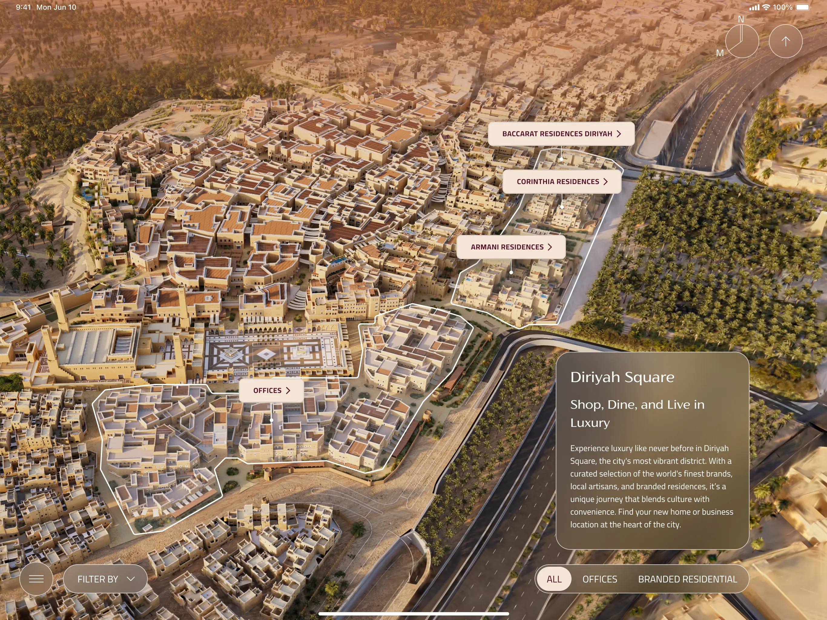
A bespoke iPad app experience that equips Diriyah's sales team to walk clients through one of Saudi Arabia's most ambitious giga-projects. Combining Unreal Engine environments, live unit availability, and a luxury-grade design system across every district.
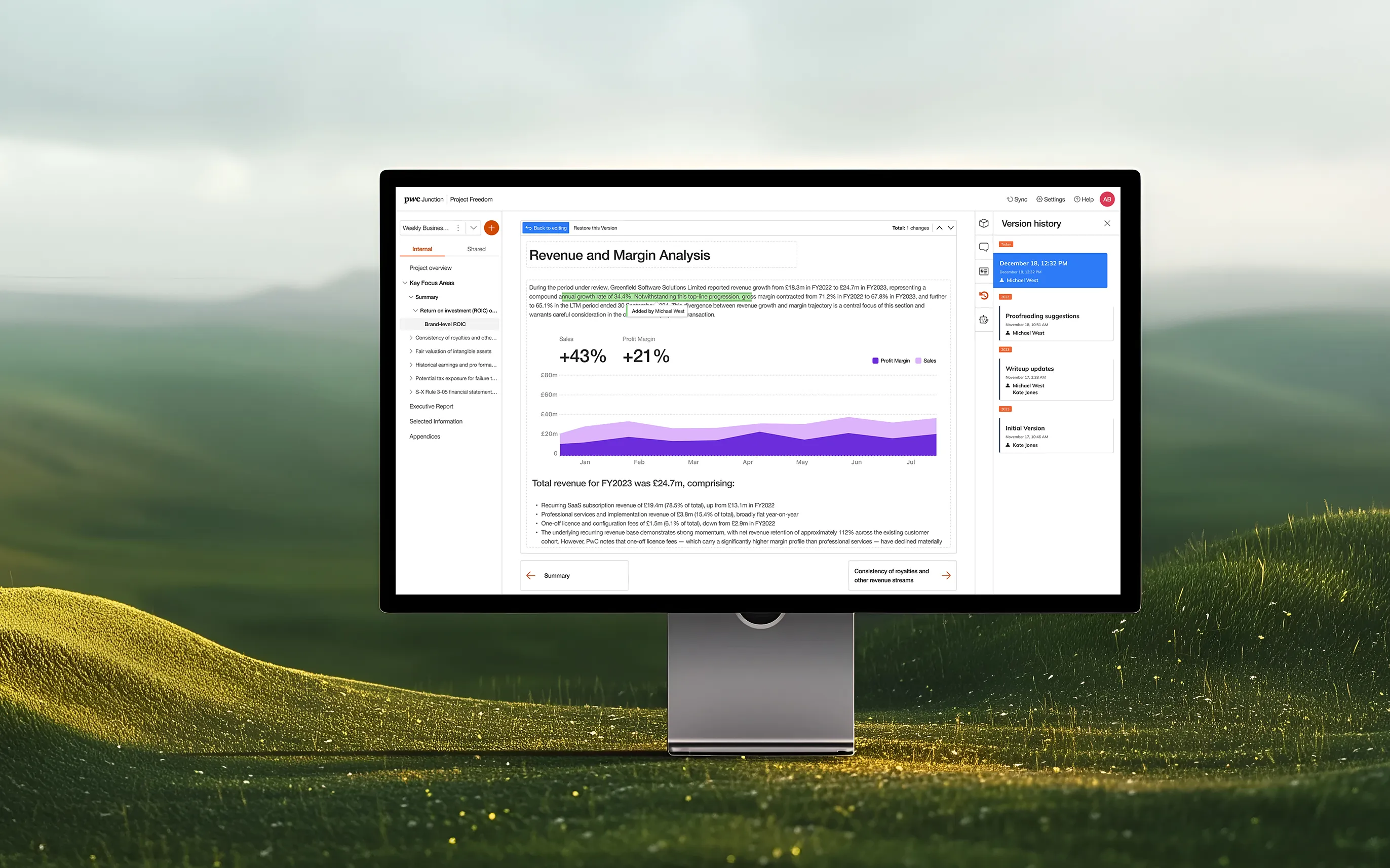
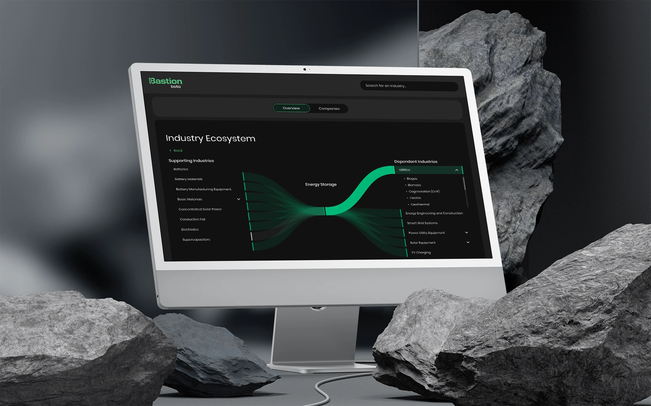
Designing a cloud-based deals platform that brings AI-powered analysis, real-time collaboration, and live financial insights to PwC practitioners and clients across 27 countries.
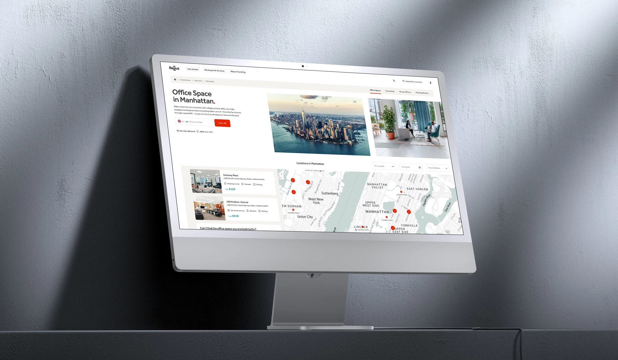
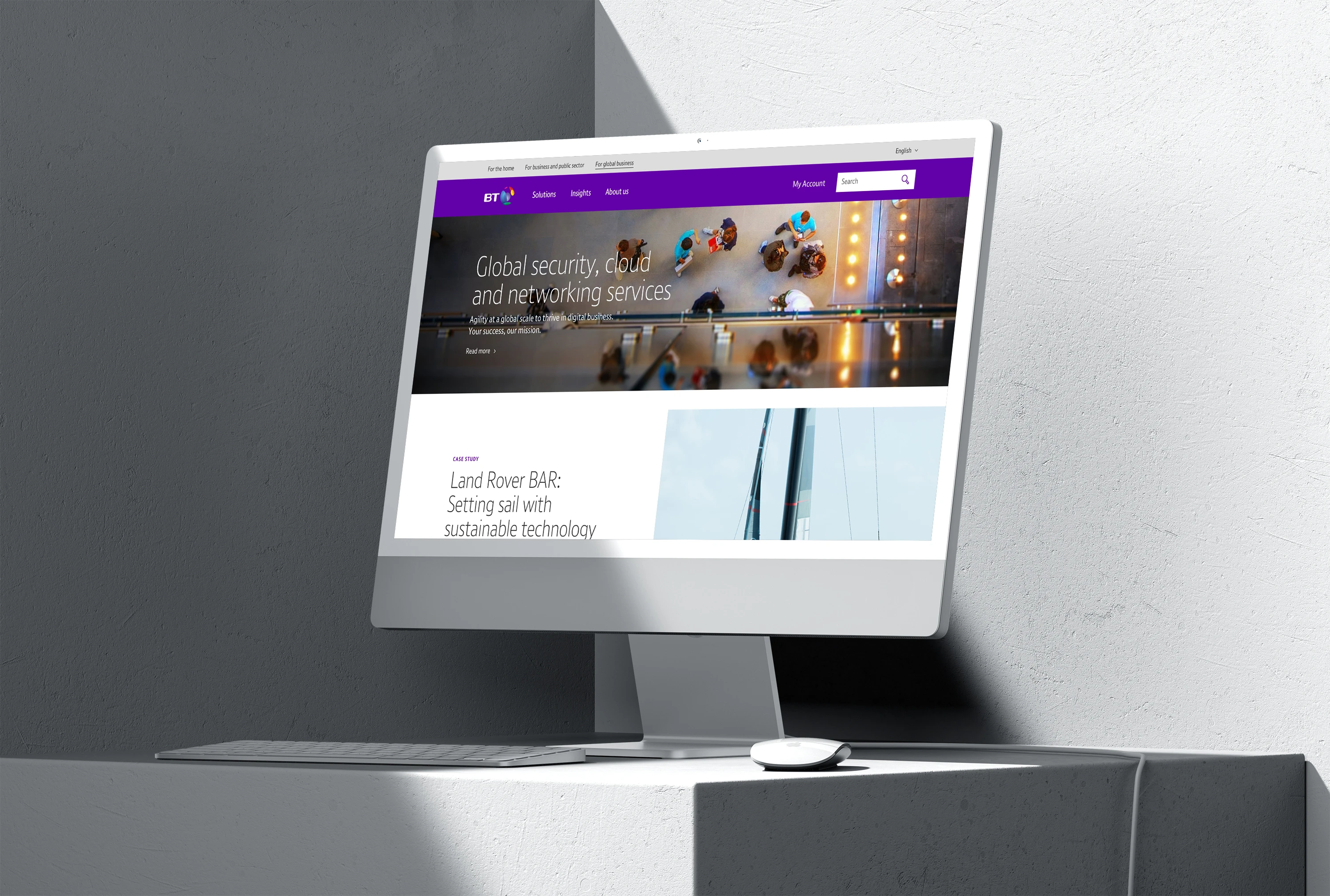
De-cluttering complex user journeys across a global portfolio of workspace solutions, making it easier for diverse business clients to navigate, discover, and commit to flexible office products.
Fizz Social: scaling an authentic social media app
This initiative focused on evolving the Fizz iOS platform from a localised messaging app into a feature-rich community ecosystem tailored for university environments.
This initiative focused on the digital transformation of Fidelity International’s internal career mobility, replacing a fragmented framework with a structured Career Pathway Blueprint.
TPT Pensions: modernising the employer management portal
This initiative focused on the end-to-end digital transformation of TPT’s employer portal, shifting from a manual, complex legacy system to a streamlined self-service management hub.