I've joined Shell Cross-Desk Analytics team as a Senior Product Designer to research and design an unified KPI Dashboard for all the "Life of a Deal" areas (LoaD) in Gas and Power Trading.
The team consisted of a product designer, front end & back end devs, a tech lead, a quant dev, a product owner, business analyst and programme manager. While being the single designer in the team I was still part of the wider Shell Experience Team for peer review sessions and collaboration.
This was a "Greenfield" project and the business requirements were still defined when I've joined. I've taken part in many business meetings and workshops where the roadmap and strategy were defined by our team and main stakeholders.
THE BRIEF
The initial product vision
The brief for this project has been to research the Back Office, Risk and Commercial Operations areas,, understand the pain points and opportunities and design a dashboard that provides insights into metrics. The main outcome from the business perspective was a dashboard that should reflect the health of all processes across the Life Cycle of a Deal (LoaD).
A new proactive workflow for the users and a management tool for the business
From an user perspective the new tool had to facilitate the workflow that at the time was split between multiple legacy tools. The existing processes and tools could not forecast the future workload and efficiently categorise the root causes that impacted the LoaD KPI's.
THE PROCESS
Understanding the business model and requirements
With limited knowledge in energy trading I've had to immerse myself into the Shell Energy business model and how the deals are finalised. I've been paired up with a business analyst that helped understand the ins and outs of Life of a Deal (LoaD).
Life of a Deal
The process of identifying and capturing a deal. Deal validation was just one part of the process.
TECHNICAL ARCHITECTURE
Connecting the data sources to our dashboard
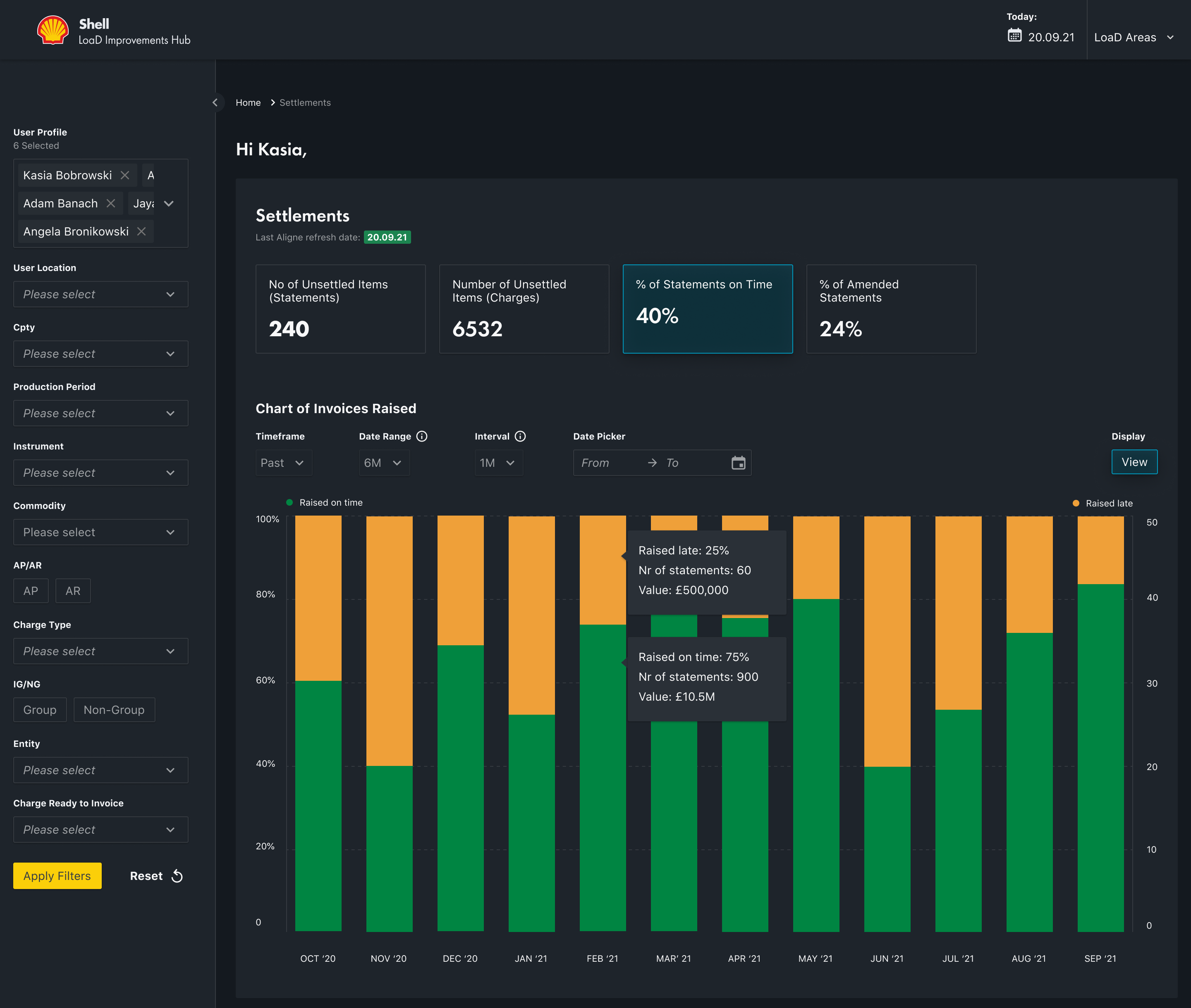
Settlements LoaD area technical architecture (simplified version)
The data has been generated from an energy and trading platform called Aligne. Together with other internal systems it generated a report that was coupled with live data. Our dashboard had to parse all the data using a set filters and KPI's. On top of that the user had to be able to assign a Root Cause Analysis (RCA) to the unsettled trades. As a result this should finalise the trade or assign a cause why the trade hasn't been finalised.
3
Business areas involved
16
Internal processes that impacted the users workflow
100's
Managers, team leads and operational users impacted worldwide
UX Research
THE UX APPROACH
Double diamond method
Being a "Greenfield" project the team had a lot of unknowns. I've decided to get everyone on board on a UX methodology that will unblock the unknowns and confirm what we do know and what the future product should be.
A set of workshops were needed to align the business requirements with the UX strategy.
THE PROCESS
Workshop facilitation
A set of workshops have been conducted to align the business requirements with the UX strategy.
CURRENT WORKFLOW
The process "as it is"
Understanding the workflow "as it is" allowed me to get closer to the users and hear their stories, hear their pain points. The users workflow consisted in processing the live deals in Aligne, if the deals could not be settled they had to assign a reasoning in Salesforce. Email was used to contact the counterparties. PowerBi was used to create KPI's for tracking the performance.
Aligne
Aligne platform has been used to aggregate and process historical and market data across all LoaD areas.
Salesforce
Salesforce has been used to deal with unsettled deals by assigning a Root Cause Analysis.
PowerBI
PowerBI has been used to visually represent unsettled deals, create and measure targeted KPI's
USER INTERVIEWS
Empathising with users
A set of user interviews has been conducted in order to understand and empathise with the user needs. The structure of interviews allowed the users to share their pain points as well as the "happy moments". Another aspect of the user interviews was to note the current workflow: what works and what doesn't. The interviewees were chosen to represent the managerial roles as well as the operational roles.
USER FEEDBACK
"I'm blind to daily operations! My team needs to invest time to maintain additional trackers: create reminders to complete the settlements on time..."
Anna Jaworska
Europe Gas and Power Finance Operations Manager
USER RESEARCH
Business requirements and user needs
Access to the LoaD Area
As a Settlements Analyst, I need access to all my KPI's so I can complete my daily assignment
Real-time data transfer between back&front office
As a Settlements Analyst I need to see Today's Data & Last Refreshed Date so that I'm aware when the Settlements Data was last refreshed
Real-time data visualisation
As a Settlements Analyst I need to see the data visually so I can identify and mitigate potential issues, and prioritise my workflow
KPI Personalisation
As a user I need to be able to see the KPI's assigned to me so I can do my job effectively
KPI Personalisation
As a Settlements Analyst, Team Lead or Manager I want to choose filters and have them loaded by default so I can start working from when I last logged in.
Filtering the data
As a Settlements Analyst I need to filter by time when I click a period of time on the chart bars or table
Access to "Unsettled Items"
As a user I need to see "Unsettled items (Charges) KPI Chart so I can identify where the issues are and prioritise my workflow
Access to the Mapping Table
As a manager I need to make changes to the Mapping Table so that I can add or amend the workload for my team based on the growth of business.
Manual Workload Prioritisation
As a Settlement Manager I need access to the " Number of Unassigned Statements" so I can assign them to my team
Workload Automatisation
As a Settlements Manager I want the platform to automatically allocate Charge Items to team members based on the Mapping Table after the data is loaded from Aligne
Keeping track of progress
As a Settlements Analyst I want to update the Custom Fields at Statement level so that I can track the progress of each Unsettled Statement
WIREFRAMING
Sketching the main user journeys
Once the user needs and business requirements were defined the next step was to wireframe the key user journeys.
Design system foundations
TYPOGRAPHY
Shell Font
Shell font is a proprietary font that it is used across all internal Shell applications and marketing communications.
COLOUR SCHEME
Primary colours
The yellow and red are the omnipresent colours across the Shell brand and visual guidelines. Lighter tints were also used in specific scenarios.
Yellow
Primary
#FBCE07
Red
Primary
#DD1D21
Secondary colours
The complementary colour scheme (with the respective lighter tints) was mostly used in data visualisation and illustrations.
Dark blue
Secondary
#003C88
Mid blue
Secondary
#0097BB
Light blue
Secondary
#89CFDC
Teal
Secondary
#0097A9
Dark green
Secondary
#008443
Light green
Secondary
BED50F
Orange
Secondary
#EB8705
Brown
Secondary
#743410
Sand
Secondary
#FFEAC2
Purple
Secondary
#641964
Lilac
Secondary
#BA95BE
Monochrome colours
The monochrome colours were mostly used in applications backgrounds and for systems components
Extra dark 1
Monochrome
#1A1A1A
Extra dark 2
Monochrome
#262626
Extra dark 3
Monochrome
#333333
Very dark 4
Monochrome
#404040
Dark
Monochrome
#595959
Mid
Monochrome
#757575
Light
Monochrome
#A6A6A6
Extra light
Monochrome
#BFBFBF
Pale
Monochrome
#D9D9D9
Extra pale 1
Monochrome
#E3E3E3
Extra pale 2
Monochrome
#EBEBEB
Extra pale 3
Monochrome
#F0F0F0
Very pale
Monochrome
#F5F5F5
UI DESIGN
The KPI dashboard main screens
The user could navigate through the main LoaD areas to assess and process the unsettled deals.
The outcomes
Benefits of using the KPI Dashboard
- Unified view of statements and charges
- Option to keep track of estimated resolution time
- Option to categorise RCA at statement level
- Team leads/Managers able to monitor workload and see the resolution of Unsettled Items made on a daily basis
- Team Leads/Managers can allocate Statements to Team members and also re-allocate based on absence/leave
Thinking big but shipping small?
Whether it's big-picture thinking or pixel-level detail, I'm in. What are you working on?
Thank you! Your submission has been received!
Oops! Something went wrong while submitting the form.
While you're here…
A few more projects worth a flick through
AuumAI
AuumAI is the first agentic AI platform built exclusively for institutional investors — automating the end-to-end workflow that LP investment teams use to source, diligence, select and monitor fund managers.
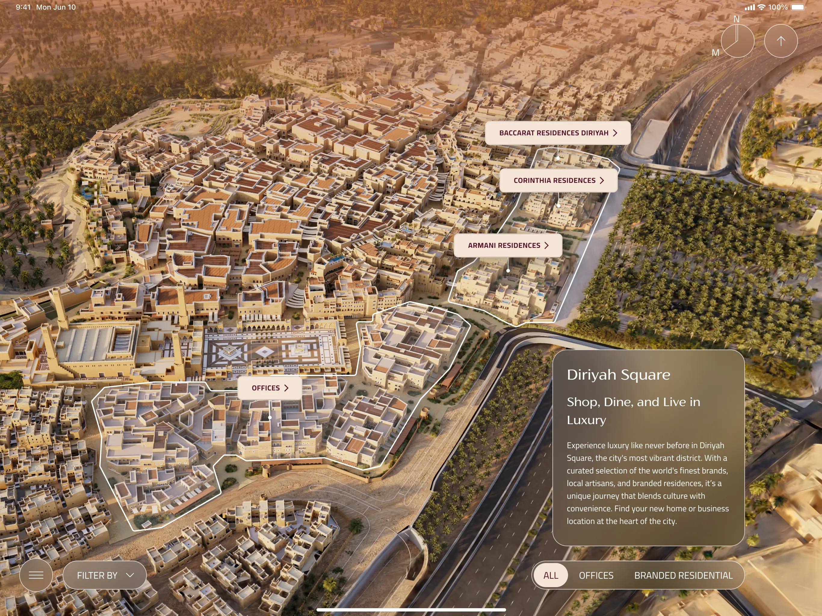
A bespoke iPad app experience that equips Diriyah's sales team to walk clients through one of Saudi Arabia's most ambitious giga-projects. Combining Unreal Engine environments, live unit availability, and a luxury-grade design system across every district.
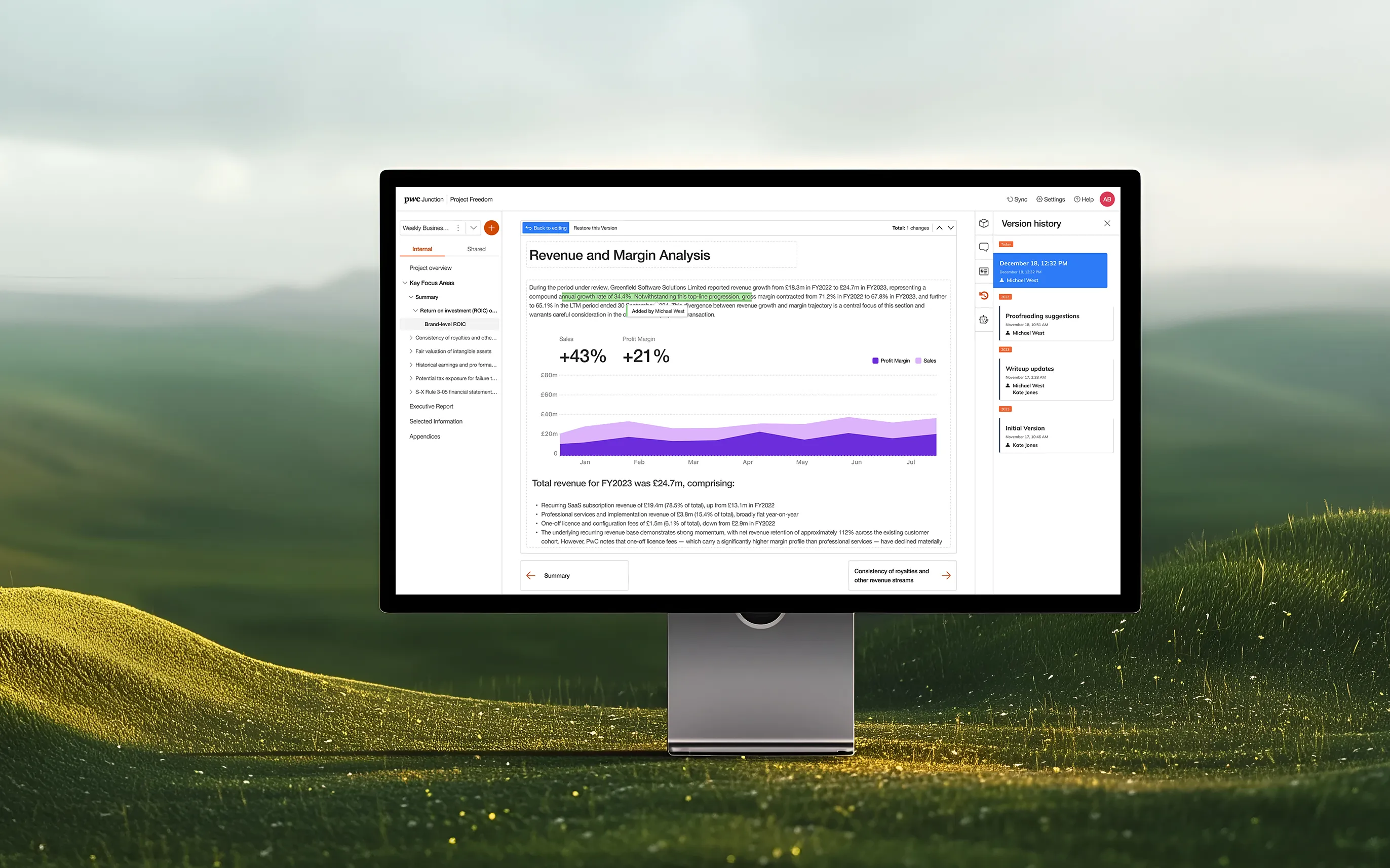
Designing a cloud-based deals platform that brings AI-powered analysis, real-time collaboration, and live financial insights to PwC practitioners and clients across 27 countries.
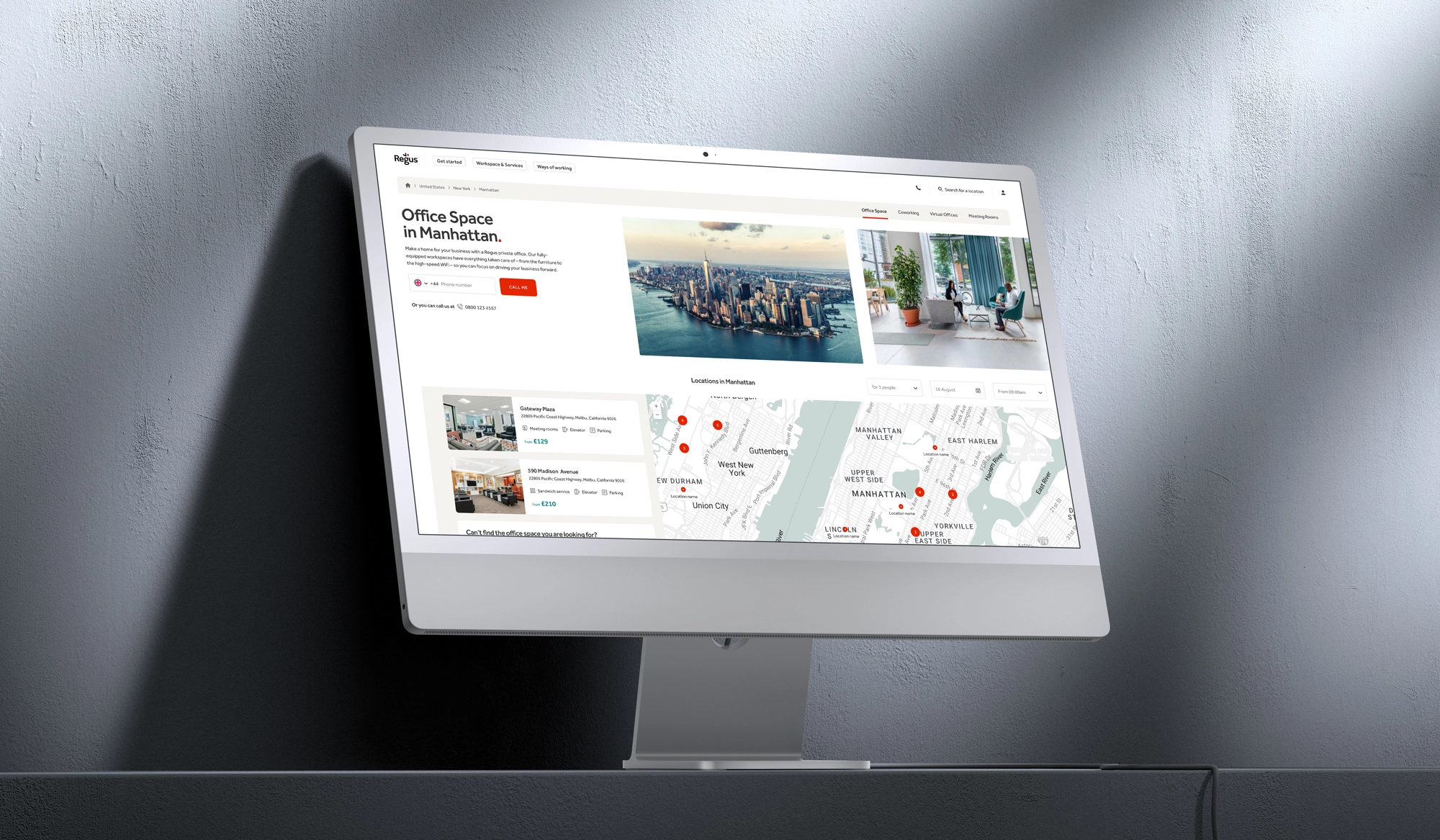
De-cluttering complex user journeys across a global portfolio of workspace solutions, making it easier for diverse business clients to navigate, discover, and commit to flexible office products.
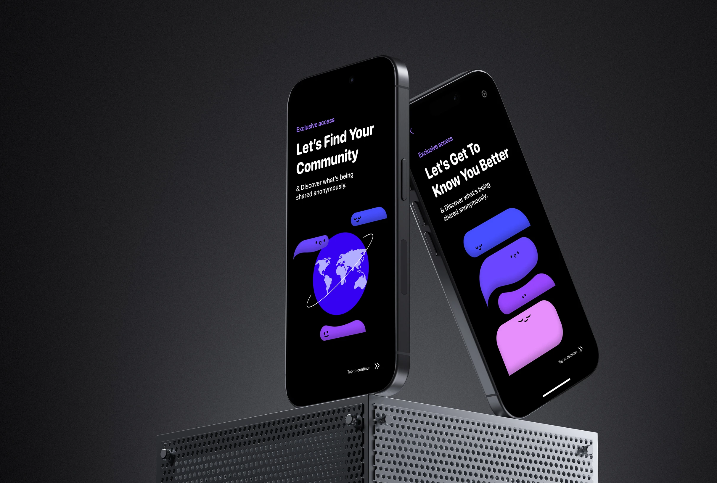
Fizz Social: scaling an authentic social media app
This initiative focused on evolving the Fizz iOS platform from a localised messaging app into a feature-rich community ecosystem tailored for university environments.
This initiative focused on the digital transformation of Fidelity International’s internal career mobility, replacing a fragmented framework with a structured Career Pathway Blueprint.
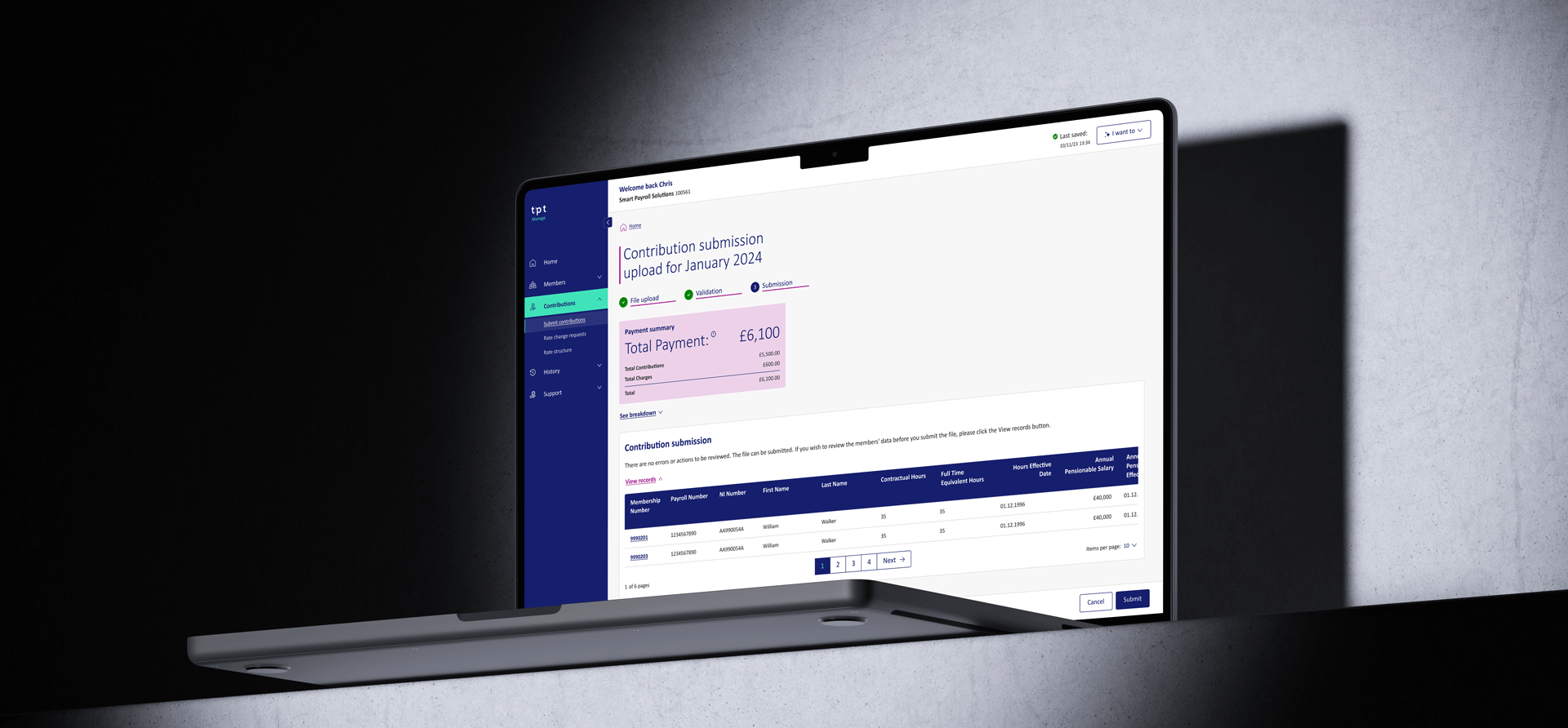
TPT Pensions: modernising the employer management portal
This initiative focused on the end-to-end digital transformation of TPT’s employer portal, shifting from a manual, complex legacy system to a streamlined self-service management hub.